


I must confess, at certain times it has looked like open warfare would break out between the support team and development team at Loadbalancer.org over the last few months.
One reason being that a major change in v7.5 is that all connection information is now displayed as a graph (rather than a static number). The support team was convinced that customers just wanted a number, a single number , a golden number... The development team was convinced that such a number was illogical irrelevant and meaningless......
It will be very interesting to see what the customers think!
Quick Update:
As of v7.6.4 the connection counters are back!
Yes it really did take that long, and only one member of the original development team survived the re-organisation to meet our customers requirements. Lesson learnt painfully.
Historically most of our customers have used Layer 4 load balancing, which is fast and transparent and simple... and while most customers were happy with the current connection number, as it sounded about right...what did it actually mean? Not a lot... as it transpired.
Loadbalancer.org, Barracuda Networks & Kemp Technologies all use LVS (Linux Virtual Server) as the underlying Layer 4 packet engine. This awesome Linux kernel based load balancer could not give a monkeys how many users or sessions are connected to it, it just blasts the traffic through as fast as possible....Don't get me wrong, LVS does know exactly what it is doing, it can tell you how many TCP connections are ESTABLISHED, WAITING etc. But does that information actually help a network administrator know how many users/sessions are connected? Not really... especially in DR mode where the load balancer can't even tell if the connection has been closed by the server so it just guesses that that each connection is open for 2 minutes...
The funny thing is that only about 0.05% of customers at Layer 4 even noticed that the connection numbers were a bit weird/useless.
When it comes to Layer 7 you would think it gets easier, which it does because at Layer 7 you know exactly who is connected at every point in time...
However 78.6% of our customers were NOT happy that the connection count was so low!
Why was the count so low at Layer 7? Because it knew damn well that the server/client disconnects almost immediately with HTTP traffic (as it is a connectionless protocol remember?)
So after several beers (yes we are English) the development team decided that what we actually need was two things...
- A 'Gauge' of how many new connections occurred over a specific time period i.e. 10 seconds...
- A specific number of connections if those connections were held open over a long period i.e. 15 RDP (Terminal Server Connections) held over a 20 minute period...
Now anyone in their right mind (and by that I mean the support team) would know that you can't put two different measures like that in the same graph...But the development team seam to know better...
So now the graphs plot connections/10 second period if the total connection count is climbing...
OR
Total Current Connections if the total connection count is NOT climbing...
I just wrote that down and it still doesn't make any sense!
I'm glad to say that the other load balancer vendors have exactly the same problem:
Look at these Barracuda Networks graphs:
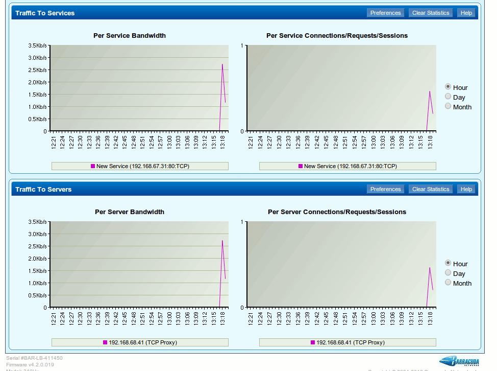
What the heck does that mean?
I was clicking the web page repeatedly and it is saying I have approx 0.42 connections? Very useful.
OK, So what do the numbers show?

Um, nothing..... am I not connected then?
I must admit Kemp Technologies do a lot better:

They try and show connections over: 60 seconds avg./5 mins avg./30 mins avg. etc
Which almost makes a lot of sense, but is pretty ugly and hard to read isn't it?
Now I'm sure that both Kemp & Barracuda will say , "Ah, yeah but, please use SNMP to figure out what the heck is going on..."
And to be honest they are right, and that is what Loadbalancer.org also recommends...
BUT...SNMP reporting is a pain to configure...so as of v7.5 all Loadbalancer,org appliances automatically and dynamically generate graphs of all connections to virtual/real servers...
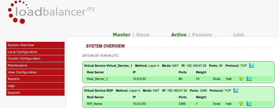
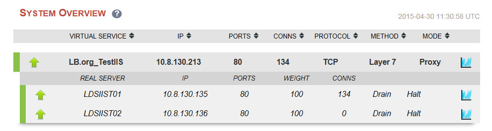
For example, the old v7.x Loadbalancer.org appliances would report the current number of connections per virtual server/real server:
Which is great for point in time snapshot recording...
i.e. we have 110,000 connections so our exchange server farm is pretty busy...
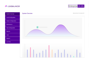
Now...in v7.5, we will get a graph showing exactly which server is handling the most traffic and also clearly highlighting any historical drops in traffic i.e. technical problems!
Just click on the little blue graph icon next to each VIP/RIP on the system overview...
And it would be really useful if I had an actual graph here to help with the explanation...
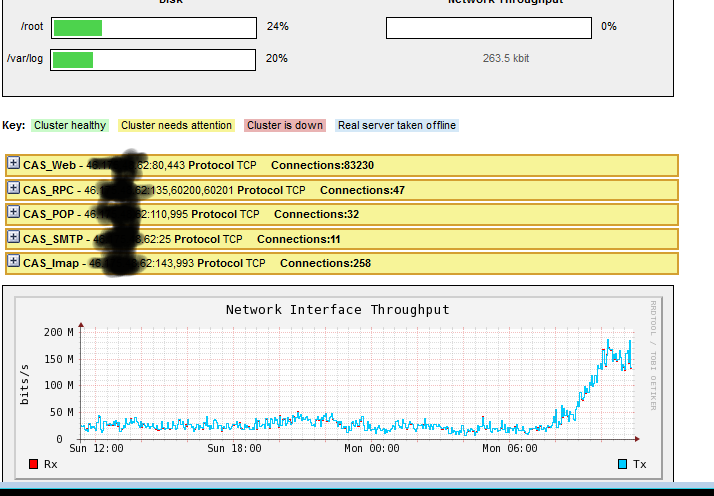
The following graph shows a fairly smooth distribution curve of traffic for an Exchange cluster:
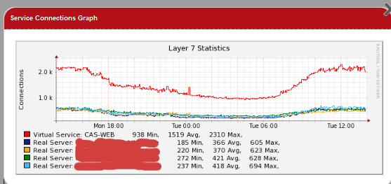
If any of the individual servers were having issues it should show up as uneven spikes in the graphs, you could then drill down to the individual server graphs and logs to pinpoint what the problem might be.
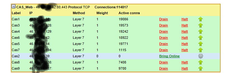
Next example is for Terminal Server traffic:
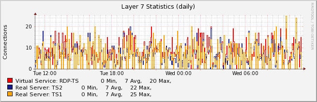
The graph above shows a fairly healthy pair of Terminal Servers with load balancing distribution over several days. Failures are much harder to spot in this kind of graph because the distribution is so un-even. You would probably need to go to individual server graphs or logs to get clearer information.
Anyway my basic point is , please can you try our new dynamic graph stuff and tell us:
a. It sucks, you suck... what do you do again?
b. Can I have my reassuring but irrelevant connection numbers back please?
c. Something more constructive...
BTW...One of the other cool things we did is move all of the server side processing of the system overview page onto the client using Javascript... No doubt this will end in tears but the intention was to allow the system overview page to handle hundreds of servers without a performance hit... This was also a reason for removing the connection counters (performance..), the graphs are only generated when you request them on a per VIP/RIP basis...
While I'm at it...
Who the heck removed the CPU load statistics!
Um, time for a quick diagram:
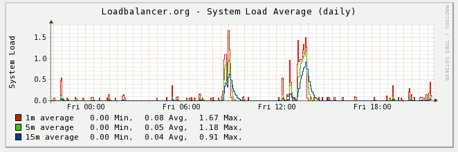
We now use a standard Linux system Load graph to tell you how busy the load balancer is.......
You know the thing you get when you type uptime on a Linux box?
[root@lbmaster ~]# uptime
22:19:57 up 15:04, 1 user, load average: 0.09, 0.04, 0.01
What the heck does that mean?
I have no idea.... BUT the basic gist is:
Linux System Load = Amount of processes waiting for a processor
Why is that useful? Because it tells you very quickly if things are going wrong with any part of the system... that's why.
Most Loadbalancer.org hardware has 4+ cores...so any load reading > 4 is VERY bad...
Contact support and have a chat...It could be Memory/Hard Drive/CPU/Quarks...who knows,but at least the graph is pretty...
Now lets get back to the conversation about numbers v graphs...
Connection number graphs are all very well and good...they will probably tell you at a quick glance if one of your servers is having issues...
But what other information can we get? Well at Layer 4... not an awful lot... so you will need to head straight to your server error/connection logs and start analyzing them.
However at Layer 7 we do have quite a bit more information:
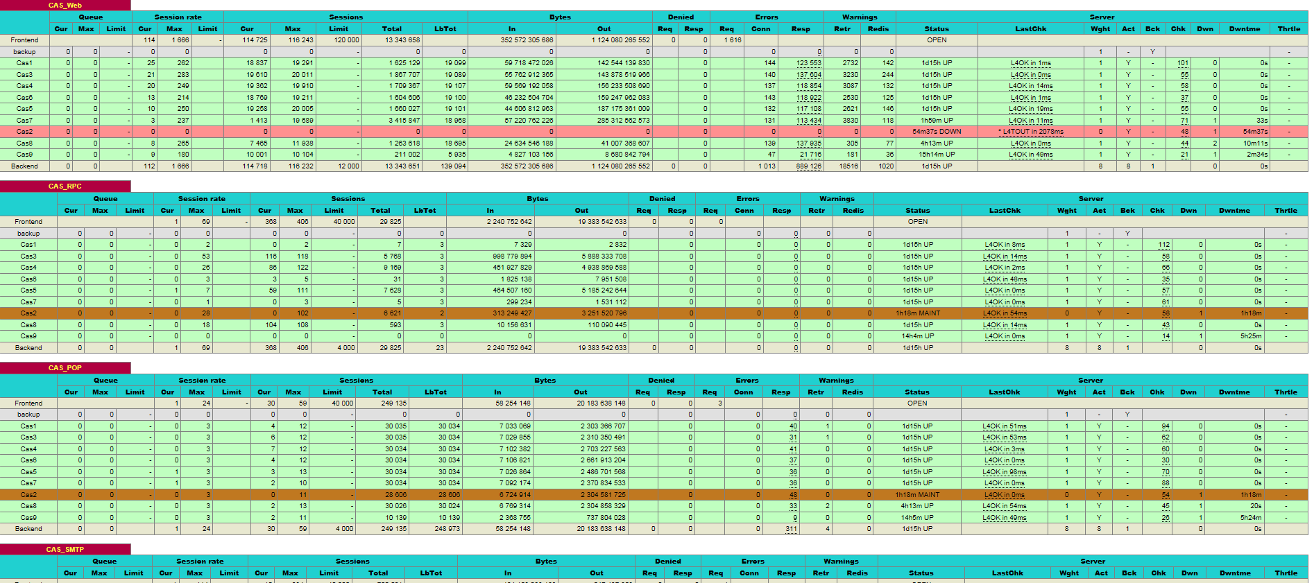
HAProxy gives a good snapshot of current and total session/connection/error data. However straight numbers are quite hard to analyse,
so wouldn't graphs be useful here as well?
Also at Layer 7 you can turn on full logging on the load balancer, but Loadbalancer.org strongly recommend only doing this briefly or using an external syslog server...
You can quickly get an awful lot of logs!